Brand systems are all the rage these days, and for good reason.
Well-conceived and well-executed brand systems allow designers, developers, marketers, and vendors to create products and experiences that are uniformly aligned to a common vision. In the course of developing human brands—and more specifically, their visual languages—we’ve found that most brand systems can be easily classified into one of two design categories: brand design and functional design. Creating this convention for thinking about brand design systems has gone a long way to providing clarity in developing project scopes, and ultimately organizing our efforts to build out visual communications systems.
FUNCTIONAL DESIGN
The way we like to think about it is that functional design aims to encourage users to perform a specific action, or to make performing a specific action easier. Functional design often—but not always—lives on screens. Web/app design are great examples of functional design. Web design in particular seeks to balance brand expression with practical, functional usability. Within the realm of functional design, function is always primary; expression never takes precedence over usability. For the most part, functional design environments exist further down the funnel, once a user is already aware of a product or brand.
BRAND DESIGN
On the other side of the design coin lives brand design, or marketing design. For our purposes, we use these two monikers interchangeably. Because most instances of branded communication don’t have as direct of a link to a specific action, brand/marketing design seeks to influence consumer perception. There is still a balance to be struck between brand expression and practical usability, but it biases toward expression in most instances; the heavy usability lifting can be done by elements encountered in subsequent stages of the funnel. A billboard is an excellent traditional example of brand design.
Another way to think about the two categories of design systems is to plot them on an objective spectrum: action vs expression.
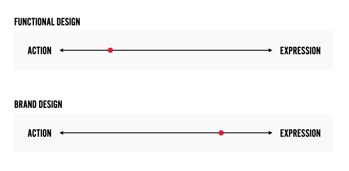
As you can see, neither brand nor functional design lives perfectly at either end of the spectrum. After all, a website has top-of-funnel brand objectives to accomplish too. Likewise, a well-placed banner ad needs to be easily and obviously clickable. So, creating effective designs is always a balancing act. But being clear on purpose is crucial to developing an effective and appropriately useful/expressive design.
CASE STUDY
A great example of a comprehensive design system can be found by studying the functional and brand/marketing design ecosystems of one of my favorite brands: Chipotle.
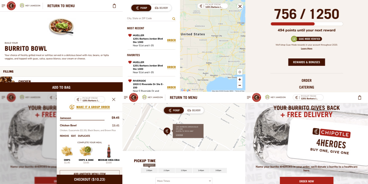
As you can see from the assembled artboard, Chipotle’s functional design leans heavily toward action. All of the included screens exist to ease the process of performing some action: find a location, order online, redeem points, or add more items to the order. That’s not to say that these interfaces lack style or consistency—they don’t. But Chipotle’s online ordering platform represents an excellent example of prioritizing function over expression.
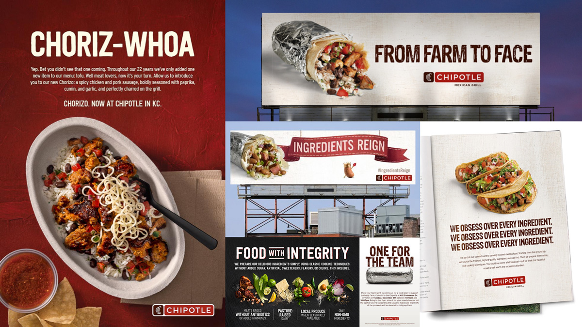
In contrast, consider Chipotle’s marketing design system, pictured above. Included here are some shining examples of classic brand design: billboards, print ads, and banner ads. These marketing messages are usually fixed and seek to attract attention or influence perception. Absent strict usability requirements, Chipotle’s brand design demonstrates greater flexibility regarding use of textures, type, patterns and photography treatments. Brand design systems generally allow for greater abstraction and creativity. This is where creatives can roll up their sleeves and have some fun in bringing the brand’s strategy—and in our case, the client’s archetype—to life.
WHY INVEST IN SYSTEMS?
What’s the point of all this? And why invest in design at all? Other than the fact that design-driven businesses outperform their laggard counterparts in the stock market, the real answer can be found in human psychology, and our never-ending journey to seek consistency and relieve ourselves of cognitive dissonance. By carefully organizing a brand, its functions, and its expressions around a strategically sound position, we can alleviate cognitive dissonance, build equity, and add measurable value.
And in Chipotle’s case, sell a hell of a lot more burritos.
