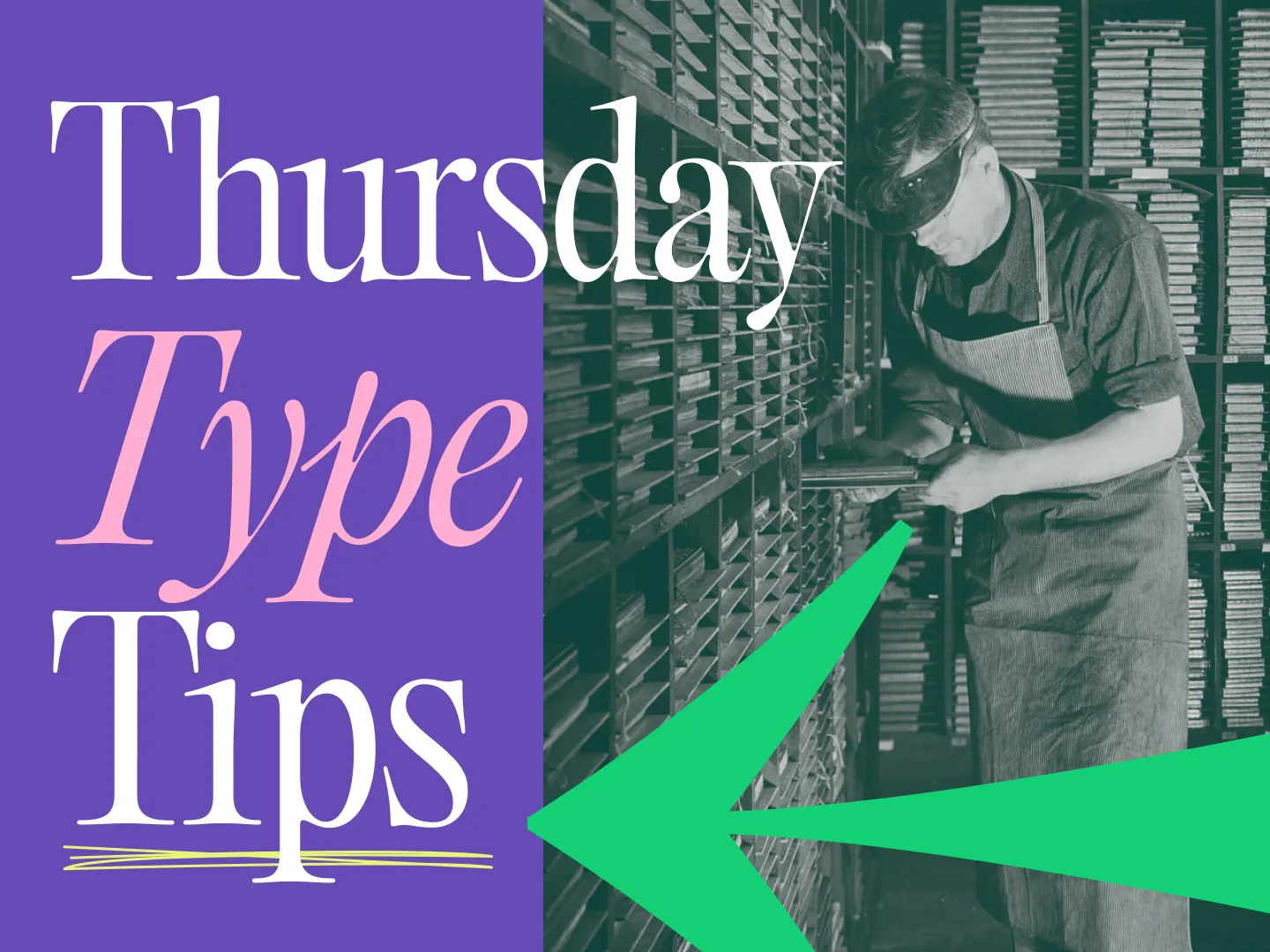
We work with type pretty much all day. Whether our designers are creating a custom script for a blog post, or laying out a brochure in InDesign, words are a way of life at Tilted Chair. Here are some useful typographical tips we’ve learned in our years of loving letters.
Wide-tracked serifs look imposing
Not sure why. But it’s something a lot of universities and government agencies have figured out. Don’t these words just feel resolute?
Only adjust tracking on all caps
Any font worth its weight(s) should possess some reasonably sound inter-letter dynamics right out of the box. If you’re laying out a headline in sentence case, leave the tracking alone, and use your kerning eye to adjust any spacing anomalies.
Larger-leaded text looks elegant
Got a luxury brand? Space out that leading.
Ragged right is beautiful
Don’t be afraid of the unique and spontaneous edge a left-justified bit of copy creates. Embrace the edge. Love the edge.
Avoid long lines of text
Be mindful of how many words your copy rows possess. Generally, your text rows should contain somewhere between 50-100 characters per line. More than that and your copy starts looking like a css-less HTML page. No good. Overly long lines of text are graphic design’s version of a run-on sentence.
Mix serifs and sans-serifs
Seemingly at odds, serifs and sans serifs can be thoughtfully paired with one another in certain applications. The result can be equal parts modern and elegant.
Avoid pure black body copy
It’s hard on the eyes, and it looks amateurish. Pulling back to 60-70% can really improve the look of page, and aid legibility.
In closing
There are type crimes being committed everyday, but with your help, and a good bit of diligence, we can leave the world’s words looking a lot more beautiful. Until next time.
