As long as I can remember, my fascination with type and lettering has been particularly focused on scripts. When done properly, the results are very elegant, beautiful, and frankly, human. Script type is much closer in nature to handwriting than the type families we encounter regularly in our daily lives. Script type can be loaded with personality.
Here, I’ll take you through my process to go from sketch to clean vector art.
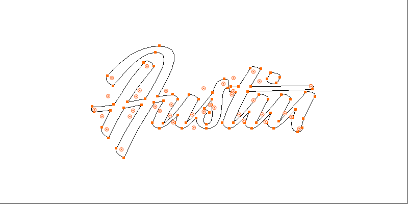
Sketch the Concept
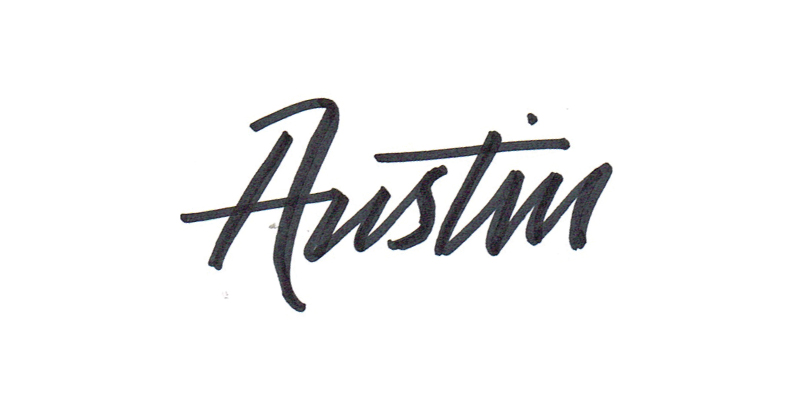
A lot of type designers/letterers will carefully pencil sketch their concept to perfection. Or, they’re masters with a brush pen, and can quickly arrive at something very close to production-ready. I usually never have time for the former, and haven’t mastered the latter, so my first objective is to arrive at a rough sketch that demonstrates the concept well enough for me to start vectorizing. That’s it. That’s usually enough to begin.
Think in Strokes
The beauty of having actually worked with a brush pen before is that it reorients your understanding of letter shapes. You need to think in strokes, not letters. Letters are merely a result of a particular assembly of strokes.
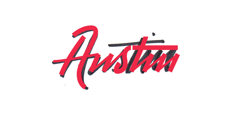
Varying Widths
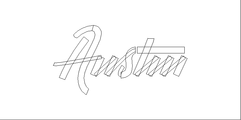
The intrigue of script lettering lives in the drama that plays out between the width of the strokes. The more variable the width of the strokes, the more dramatic the final result. As you can see here, when I first copied the sketch in simple vector lines, I did so in a way that sets the stage for the variable-width drama that will play out later. Strokes that move sideways or up are thin. Strokes that move down are thicker. It’s one of the most fundamental principles of lettering. Don’t believe me? Try reversing it sometime, and see just how wonky and alien-looking the final result is.
Outline Your Shapes
Once you feel confident in the simple vector lines, go ahead and expand the shapes.
Add Transitions
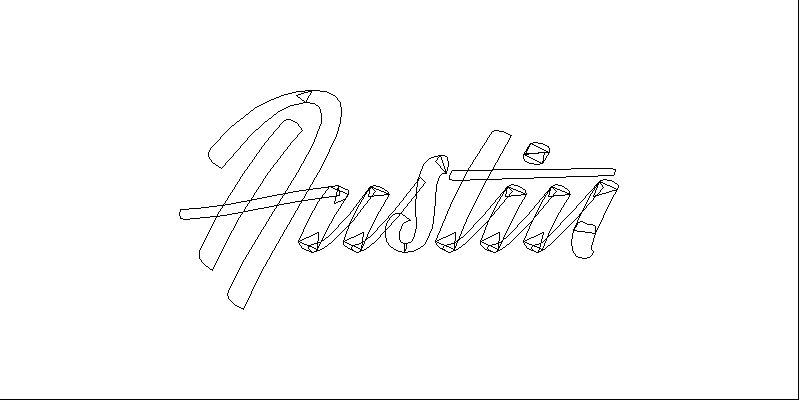
If you noticed that we’re still not at something resembling finished brush type yet, you’re right. We need to add the little stroke terminals that represent the transition between stroke directions. One thing I’ve noticed when working with a brush pen is that these terminals are always a little rounded. I add the vector shapes with that in mind. These little endings are so, SO important. They account for so much of the type’s personality when it’s all said and done.
Refine!
This is where the tedium of working with type comes in. You need to refine, and refine, and refine some more to get closer to something finished-looking.
Check the Tilt (;))
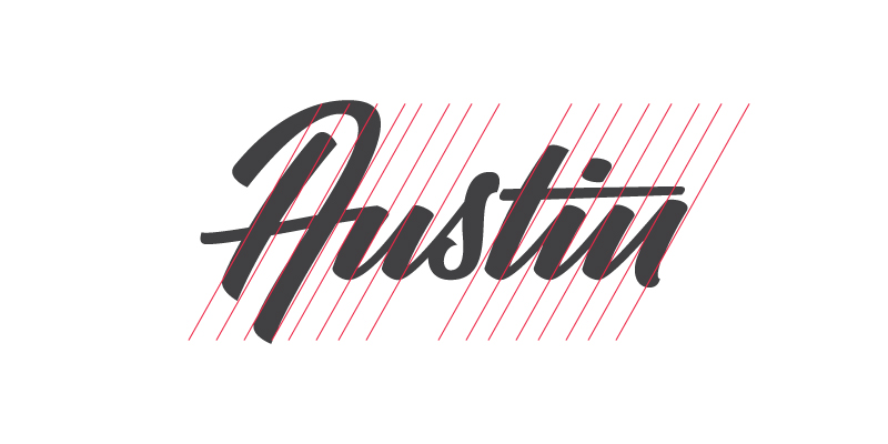
Another thing to confirm early in the refinement process is that the tilt of the letters is pretty close to consistent. Mine aren’t exactly perfect, but that’s what I wanted. I was seeking a finished product that looks to have come from the hand of a skilled brush letterer, not a robot.
Combine Your Shapes
Think you’re ready to combine shapes? Okay, but don’t destructively edit! I save to a new artboard every major new stage in the process, just in case I get too far long and need to revisit a step.
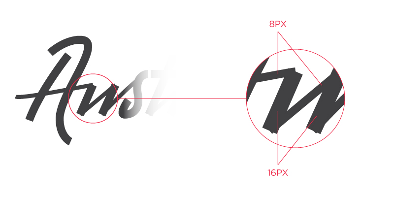
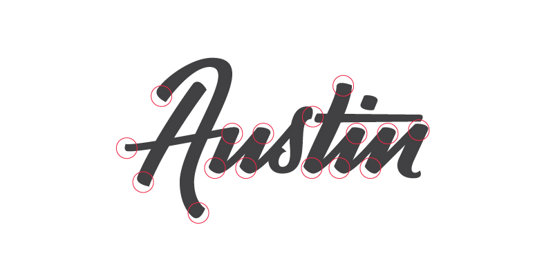
Check Your Anchor Handles
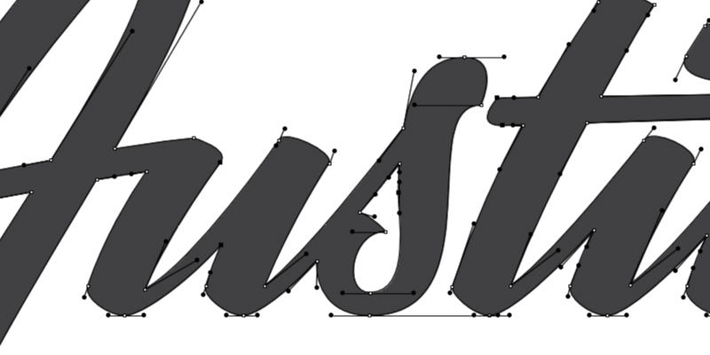
This is the nerdiest of type nerd habits, but it’s the right way to develop vector type: check your anchor handles. Most, if not all, should align in 90-degree increments relative to the baseline, OR, they should align to an established tilt of the strokes. This is important. It makes adjusting/tweaking way easier, and it’s just the right thing to do.
You’re All Set!
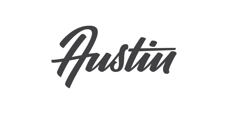
Look at you, you little letterer, ;).
Conclusion
Drink some rum, and cheers to a job well done!