KEY TAKEAWAYS
- “The bridge” helps us consider what an archetypal position means for a brand’s visuals.
- Establishing a visual style that reinforces a brand’s position is just as important as the position itself.
We love archetypes.
For those who have been following Tilted Chair for any amount of time, you’re probably familiar with the archetype methodology we employ in developing authentic, lasting, and first-class brands. The framework itself was conceived by the Swiss psychologist Carl Jung as a means of attributing and explaining human behavior and motivations, and later applied to the realm of branding, marketing, and advertising by Margaret Mark and Carol S. Pearson in their essential-for-any-marketer field guide The Hero and the Outlaw. Since early 2015, archetyping has served as the backbone of all that we do at Tilted Chair.
But the archetyping process only gets you so far, and without the reinforcement of relevant and compelling brand visuals, the assignment of an archetype leaves marketers and brand managers with a purely academic and theoretical system. To truly apply the archetypal perspective, a brand’s positioning must be fortified by a carefully considered visual communications language.
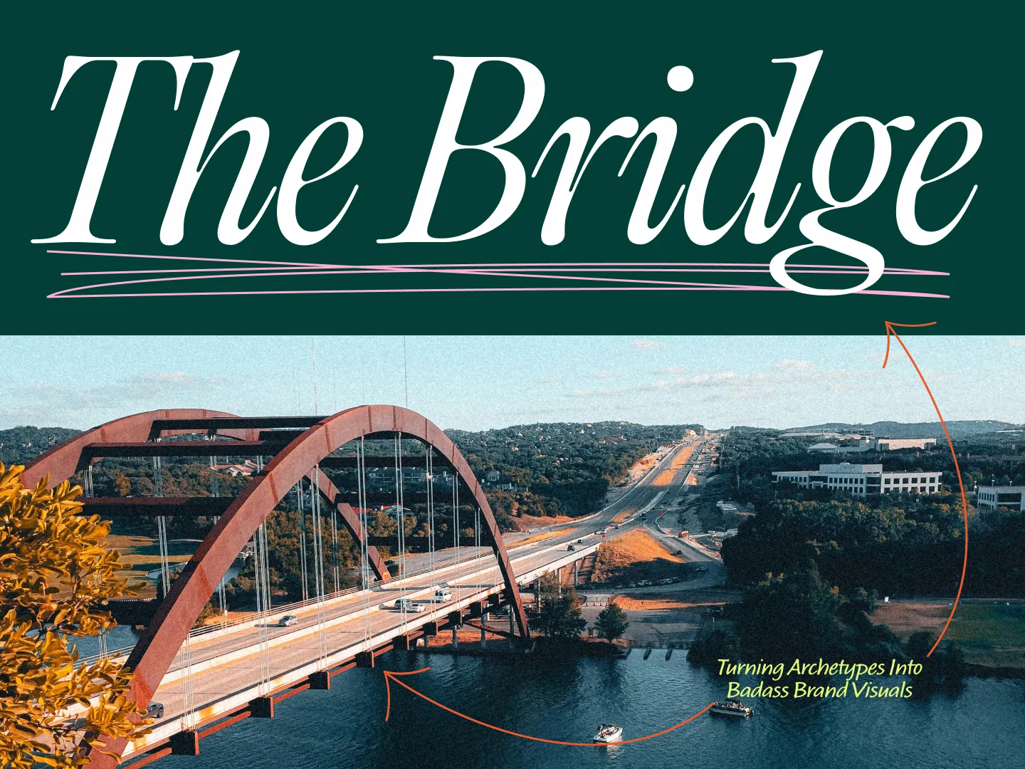
Enter “the bridge.”
The bridge is the all-important milestone in a branding exercise where the archetype work our strategy team does gets handed off to our creative team for interpretation and ultimately, visual expression. In short, the bridge is where the rubber meets the road. And there’s one important question the bridge helps to answer: “How does this archetype inform our brand visuals?”
To illustrate how we answer this question—and as an homage to our favorite archetype branding book—allow us to present the bridge portion of recent archetype presentations for two of the most essential archetypes: The Hero and the Outlaw.
THE HERO
In narrative film and literature, the Hero archetype is ubiquitous. However, for our most recent bridge presentation involving a Hero brand, we drew inspiration from a less obvious but equally powerful domain of inspiration: sports.
It’s no surprise that sports are a relatable and powerful domain of heroic feats. From the way we lionize athletes to the way we pay them, athletes are some of our society’s favorite heroes.
Nowhere is the Hero archetype more evident, prevalent, and effective than in college football. Check out the Instagram accounts of two of the preeminent college programs: Texas and Alabama. Each page represents a veritable smorgasbord of heroic imagery—they’re literally trying to out-hero one another. We’ve assembled a mood board of selects below to demonstrate:
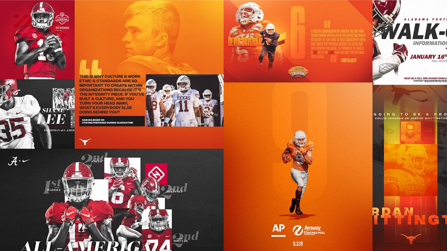
The keen observer realizes that none of this is by accident—these visuals have been carefully developed to reinforce each team’s heroic positioning. But what specifically about the visuals accomplishes this?
Manipulate lighting to create focus, tension, and drama
Pay close attention to the lighting atmosphere created in each graphic. Even though it’s subtle, the sophisticated lighting approach renders a moody tone.
Utilize bold/extreme typography that creates a sense of kinetic energy
For Texas, this can be seen in the tall, heavy, condensed sans-serifs. For Alabama, it’s found in the massively variable-width italic serifs.
Create a grid—and then destroy it
Anyone who’s spent more than five minutes talking art direction/design at Tilted Chair knows we’re big fans of the grid. If we really dug into the graphics, I’m certain we’d find one. I’m also certain we’d find instances of it being violated, which also works to establish drama/conflict, the crucible of the Hero brand.
Go BIG…or go home
In the classic sense, the Hero is bold. Same with college football stars. Here, they’re presented as larger than life.
Textures bring heroic compositions out of the virtual world and into the real one
Our graphic compositions should harken back to real, tangible physicality lest we forget football is played in the real world.
The Hero is drawn to conflict—this is where they thrive. They don’t shy away from it.
This is far-and-away the most important lesson. Heroes exist to resolve some conflict. The way they’re presented graphically should embrace that challenge.
THE OUTLAW
In contrast to the Hero is the Outlaw. (Perhaps counterintuitively, the Outlaw lives not on the opposite side of the archetype wheel, but instead within the same house—the House of Becoming—as the Hero archetype.)
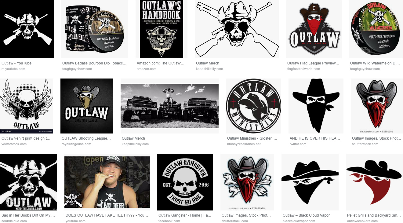
A quick Google search reveals our society’s collective perception of the Outlaw and its rebellious symbols:
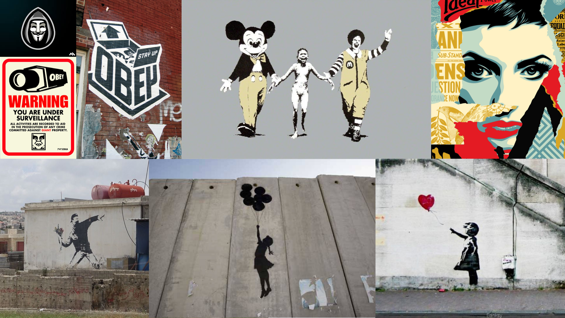
On a recent project, we pushed past this first line of thinking to a more interesting place to build our bridge: street art.
Think about it: street art is the perfect expression of modern rebellion. It’s subversive, culturally relevant, often clandestine. Much of the street art that’s gained attention in the last 20 years is also some of the most provacative and rebellious. See for yourself:
Within the realm of marketing, it’s clear that some brands have taken this rebellion to heart and developed some surprising and inventive instances of commercial art that challenge what people expect from advertising:
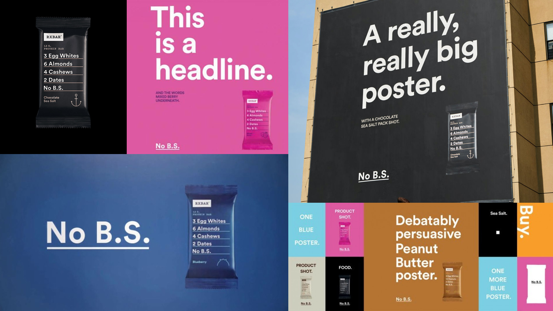
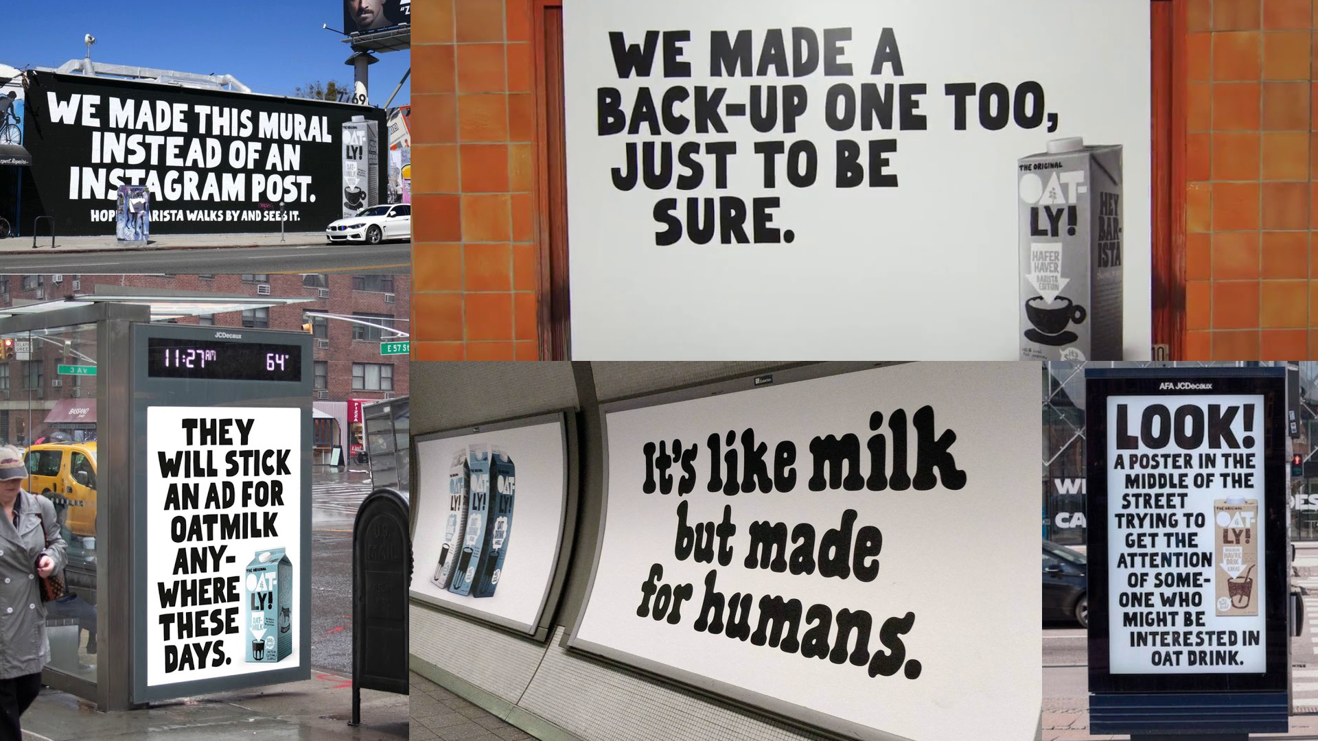
These things in mind, there are quite a few lessons that the Outlaw brands can glean relative to their visual expression:
Strive for culture, not commerce
Cultural commentary provokes in a way that typical commercial messaging does not.
Don’t be afraid to polarize
After all, there’s “us” and there’s “them;” you’re either with us or you’re not. Use extreme or unpredictable combinations of text, colors, or imagery to surprise viewers.
Create a grid—and then destroy it
You thought heroes were the only ones who could benefit from the drama of a broken grid? The Outlaw laughs in the face of the grid, for the grid shows what’s to be expected, while the outlaw delivers just the opposite.
Imagery should provoke pause, thought, or interruption
The Outlaw brand is unforgettable for just how different it is. Mixing seemingly unrelated elements or graphics together can result in divergent compositions no one saw coming.
Use bright, attention-grabbing colors to achieve disruption
Boring is, well, boring. Mix in some vibrant colors to bring a little life to an otherwise grayscale world.
Rethink everything
This is the Outlaw’s most important tenet. Wherever things are done by default is where the Outlaw will find new ways of doing things that surprise, disrupt, or shock the world.
How about that:
real, actionable design insights and inspiration that move our thinking from the academic to the applicable. While we focused only on two of the twelve fundamental human archetypes here, this exercise can and should be done as a means of considering the practical design implications of any one of the assigned archetypical perspectives.
Ladies and gentlemen, you’ve successfully crossed the bridge.