
KEY TAKEAWAYS
- Websites are never done.
- Build for the future.
- Design based on data.
- Content drives design.
- When in doubt, steal.
It should come as no surprise to even the novice marketer that digital marketing and digital branding growth trajectories have far outpaced their analog alternatives. From Google replacing the Yellow Pages to online restaurant ordering, nearly all modern commercial transactions carry with them some kind of digital component. The COVID-19 pandemic has only accelerated this trend toward an increasingly digital world of commerce.
For most businesses, at the core of this new digital reality resides one all-important element of the digital marketing funnel: a website.
That’s probably not a revelation. After all, you’re reading this article on our website right now, one of the most important tools in our marketing tool chest. Our website is great for profiling past work, demonstrating culture, communicating process, and facilitating communication.
Which leads us to the topic of this article: websites. Tilted Chair has designed, developed, and deployed hundreds of them in the last eleven years. From Austin art museums to nude cruises to campaigns for president, we’ve pretty much seen it all when it comes to web.
Over the course of all those years we’ve learned a lot about what it takes to design and develop effective web platforms. Here, we outline our web philosophy orientation, which we take all new website customers through at the outset of each web design project.
1. Websites are never done
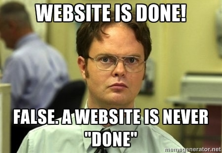
Even Dwight knows websites are never completely finished.
That’s kind of the point of them. They’re an interactive marketing tool, meaning they’re always changing. These aren’t print ads we’re talking about here, people. They’re living, breathing things that are constantly in need of updating, optimization, and upgrading.
We ask that our clients prepare themselves—psychologically, and financially—to continually invest in their website.
2. Build for the future
“I give you: iPhone.”
Just think back to 2007, before the iPhone launched: ask someone about a “mobile” website back then, and you’d probably get a deer-in-the-headlights stare. Today, mobile web access has surpassed desktop access, and a great mobile experience is table stakes in the modern digital ecosystem.
We don’t know exactly what the next mobile revolution will be in the world of web design and development, but we can sure-as-heck try to be ready for it.
3. Design based on data

Tall or short pages? Let the data decide.
Either firsthand or found, good data can be very counterintuitive—and illuminating.
Take page length, for instance: most people’s instincts tell them that pages shouldn’t get too long, and that having long web pages will diminish visitors’ experiences. (If I had a dollar for every time I heard a client say, “This page seems like it’s getting too long,” I’d have…quite a few more dollars.)
As it turns out, in many cases the opposite is true, and asking users to scroll is actually a fairly low-cost behavior request.
Or, take the hamburger mobile menu, a staple of mobile websites the world-over. Perhaps somewhat surprisingly, they’re not good for conversions, and the savviest interactive designers are eschewing them for simpler, more intuitive solutions.
The lesson: the best solutions aren’t intuitive, and designing based on data—rather than subjective preference or “gut”—will lead us all to better-performing web experiences.
4. Content drives design. (And never the other way around.)

Technology makes amazing things possible. But don’t let that get in the way of your content.
Interactive design and marketing has entered into an exciting new era. The device you’re reading this article on likely has orders of magnitude more computing power than those available to assist with the Apollo 11 moon landing.
That’s some serious computing power, and it’s making some really cool web experiences possible. Which is awesome, except that there’s plenty of evidence out there to demonstrate that superfluous interactive features can actually detract from users’ experiences when browsing a website.
So what do you do? Well, the answer is simple: allow the content to drive design, and never the other way around.
At Tilted Chair, we always keep the content strategy in mind when designing a website. Our customers have business objectives and their users have content needs; our design should resolve the tension between those two objectives. We should get users from point A to point B as quickly and seamlessly as possible. And where design can support and facilitate those goals, we employ it.
What we don’t do is force content into a preconceived aesthetic, structure, or interactive device. That’s the kind of thinking that leads to worse bounce rates, worse user experiences, and ultimately, a lower-performing website.
5. When in doubt, steal.
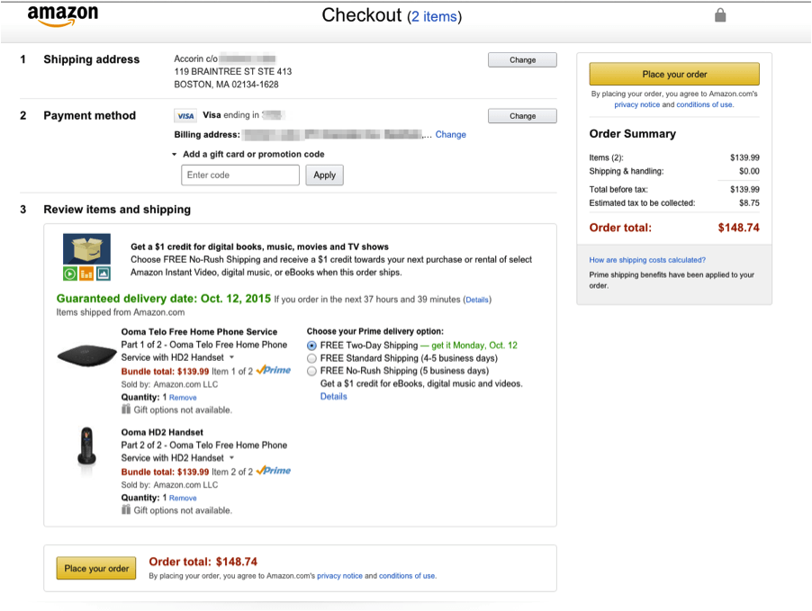
Amazon’s checkout page: ugly, but effective.
We’ve all seen various versions of the old idiom, “Good artists copy, great artists steal.” It’s unclear who first spoke this piece of wisdom into existence, but in keeping with the spirit of the quote, we’re stealing it and applying it to interactive design.
Think about it: most of the sites we design are not wholly new concepts. Almost all of the problems we may face during the design process have already been solved by bigger organizations with more manpower, bigger budgets, and better resources.
Take Amazon, for example. Amazon employs hundreds (if not thousands) of web engineers who work every day to see if they can improve the website’s conversion rates by fractions of a percent.
And while we may not be able to peak under the hood of the Amazon research machine, we can certainly see the results of their efforts: they’re right in front of us. Is there any use in trying to top Amazon as far as check-out experience? (Hint: probably not.)
Conclusion
The world of web is an oft-evolving forum for breakthrough new ideas and creativity. But if that creativity isn’t paired with sound strategy, a linear process, and data-driven user experience, you can be left with a pretty website that doesn’t work as well as it should.
And before long, you’ll find yourself doing it all over again. Not exactly a recipe for reaching digital zen.